
Thursday, September 27, 2012
Downtrodden
Henri Matisse.

HEAD OF EOW

Queensboro Bridge

"A Sunday on La Grande Jatte" by Georges Seurat

Margot in Blue

Storm Clouds Above Manhattan

This is called Storm Clouds Above Manhattan by Louis Lozowick. This was drawn in the late 1930's. I chose this art work because I think the skyline of New York City is one of the best sights to see, and the way he depicted it with clouds over it was done very well. This drawing really draws you in and makes you appreciate the detail of the clouds as well as the detail of the skyline. This is the point of view that everyone sees the skyline from.
False Start by Jasper Johns

False Start by Jasper Johns
Jasper Johns, Jr. (born May 15, 1930) is an American contemporary artist who works primarily in painting and printmaking.Born in Augusta, Georgia, Jasper Johns spent his early life in Allendale SC, with his paternal grandparents after his parents' marriage failed. He began drawing when he was three and has continued doing art ever since.Johns is best known for his painting Flag(1954–55), which he painted after having a dream of the American flag. His work is often described as a Neo-Dadaist, as opposed to pop art, even though his subject matter often includes images and objects from popular culture. Still, many compilations on pop art include Jasper Johns as a pop artist because of his artistic use of classical iconography. Early works were composed using simple schema such as flags, maps, targets, letters and numbers. I really enjoyed this painting because i love how he used warm colors. it is very interesting by the color words he actually drew on the this painting. I believe that this also catches your eye do to the mess of the colors blending together.
Composition VII

Wednesday, September 26, 2012
Remix Paintings

Above is a painting by George Baselitz which he refers to as a "remix" painting. " I have thought for a long time about what to call what I do. I liked the word 'remix' because it comes from youth culture.". Baselitz paints with swathes of bright, transparent hue across white canvas and explosive, meandering lines, The remix paintings are considered to be radical transubstantiation based of his earlier works. They are part caricature, or part ghost of the subject that is depicted. We can see this in the painting above in the white, middle section.
van Gogh


Numbers in Color

This is a painting by Jasper Johns, he was born in Augusta, Georgia on May 15, 1930. The motif of the numbers and letters have made his painting famous.
I like this painting because the colors stand out, he uses for the most part complementary colors: green and orange. I like the painting because the style of painting numbers is interesting I would never have thought of that. I like how the overall view of the painting does not look like number, it just look like an harmony of multiple colors.
Nobspital

This drawing is called Nobspital and the artist is Paul Noble and it was created in 1997. The artist used pencil on paper to create this image. This building is something that Noble imagined and then was able to create a realistic image based off of what he remembered. I think it is very impressive that their is so much detail in this drawing and it was all just something he imagined.
The Beach of Tangier

Tuesday, September 25, 2012

The reason I chose this painting was one, because again Johannes Vermeer is one of my favorite painters, and two because I love how he uses light to signify his subjects. In this case, the lady at the desk with the fur trimmed coat. The rest of the room is toned down color wise, and then his subject is put in bright yellow with the light shining right on her. I also like how it seems that his subject is at ease in the painting. It's as if he was able to take a candid picture of her and paint her as such. The painting does not feel staged, it feels natural.
Rooms by the sea

Monday, September 24, 2012
A Wind God

Artist: Pietro da Cortona
Medium: Chalk on Paper
Pietro de Cortona was born in 1596 in Italy. He was one of the leading Baroque artists of his time. He did a lot of decor work in Rome and Florence throughout his life and is most commonly known for his "frescoed ceilings". Cortona also became a famous architect and worked on projects such as the Santi Luca e Martina, Accademia di San Luca and the Villa Pigneto. These are just a few of his projects, among his many interior paintings. This sketch in particular was done simply with chalk on paper. Entitled A Wind God, it is one of many line drawings done by Cortona. I liked this one because it is not hectic, there is not too much going on and to me it is calming. It caught my eye when reading this chapter and stuck in my head all day, so I knew this was going to be a piece I loved.
Thursday, September 20, 2012
Lucas Samaras Untitled


Painting: The View of Delft
Painter: Johannes Vermeer
Date: 1660
Medium: Oil on canvas
This painting is yet another accomplishment of my favorite painter, Johannes Vermeer. From what I can gather, it seems like it was done right after a rain storm when the sun was beginning to shine on his little town again. Notice the dark clouds moving away from the town and the bright sky coming towards it. One might ask, how would you know if the clouds were moving away from the town? From what I can see in the painting, it seems almost like the ground is saturated especially in some areas more than others, and it even seems like the buildings have a look of saturation as well. Plus the water level in the river looks higher than it usually would be.
Roy Dean Deforest

Pat Passlof's "Eighth House #13"

Rhino

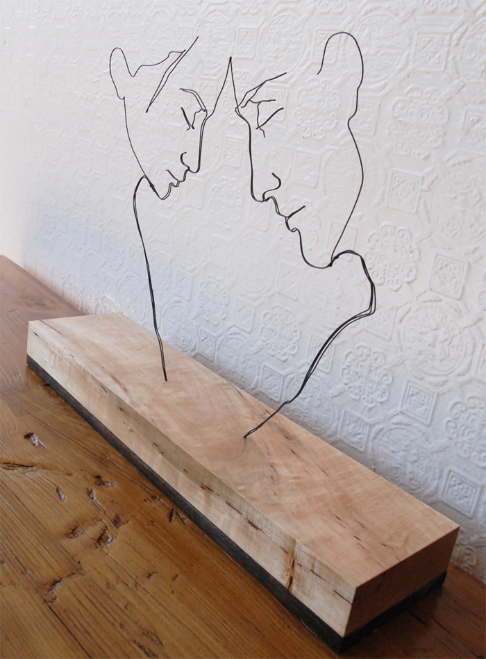
Gavin Worth - Corpus Callosum
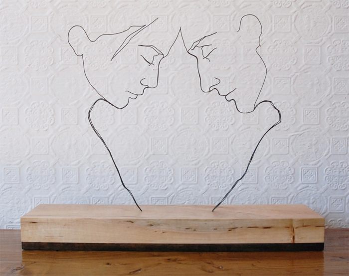
These amazing sculptures by Gavin Worth are molded wire in a board. The effect is a standing drawing. Gavin Worth is completely self taught which is amazing. I just love the what that this looks like a drawing, but is in fact a sculpture.
Torment of Saint Anthony
.jpg)
This painiting, "The Torment of Saint Anthony", was Michelangelo's first well known painting. It was done when he was a mere boy of 12 years of age. It is one of only four surviving panel paintings of Michelangelo, so it has some signifigance to it. I enjoyed the painting for the detail in the struggle you can feel in Saint Anthony. The evil temptations or deamons attacking Anthony can represent the struggles he went through as a man, and gives a visual to the everyday battles humans must endure.
Roberto Bernardi

Roberto Bernardi's super realistic oil painting's are amazing to look at just simply because of how ultra realistic they are. It actually looks like those are real, drinkable sodas. It is amazing how something as simple as soda cans can be so beautiful just because of how real it looks. I find paintings that are like this interesting because of how much time and dedication these artists have to put into them to get the perfect look.
Rick Leong- The Incubator

This is an oil painting by Rick Leong. This painting really interests me because of how everything looks. You can kind of make out that this might of been some sort of forest but the way he manipulates everything to make it looked all messed up is cool. This painting is call The Incubator but I'm not really sure why. I'm not sure why I like it so much but I find this picture very distortedly beautiful and different.
Apocalyptic City

Pierrot and Guitar

Medium: oil on collage on cardboard
Year: 1924
Salvado Dali was a Spanish surrealist painter, among other things. Born in spain in 1904 he was pushed by his parents to harness his talents. He attended drawing school and was introduced to modern painting by a family friend Ramon Pichot. He also studied at the school of fine arts and gained practice in cubism. This painting specifically is one of his collages. I loved it immediately because I am drawn to the warm colors and the musical element that it involves. Music and art are very important parts of my life and this incorporated the two.
Kara Walker

Kara Walker is best known for her room size tableaux of black cut paper that examine the underbelly of Americas racial and gender tensions. Kara was born November 26, 1969 She was born in Stockton, California, Walker moved to the south at age of 13 when her father, artist larry walker, accepted a position. i think this drawing is very cool. I love how she uses black and white. I also love the scenery of this drawing.
Wednesday, September 19, 2012

Head of E.O.W

I like this painting because the colors used are standing out from the dark background. I like the style of the artist; he does not put a lot of details when painting the body parts. For example, you barely see the hands or the ears. I like how he applies different shades of colors to paint the lights and the shadows on the body and on the clothes.
Woman-Lying-on-her-Side

I like this picture because the woman is lying, not doing anything. She is starring at something beautiful or she is thinking about something great. I like this picture because it looks peaceful; the woman seems to have no worries. With the things we got to do in this life, it is not often that people can have that kind of time to lay in their bed smiling, or thinking about something awesome
The Songs of Ossian

The following painting was illustrated by Jean Auguste Dominique Ingres, who was a french artist. He was born August 29, 1780 in Montauban, Tarn-et-Garonne, France and died January 14 1867 in Paris, France. His active years of drawing was from 1800-1867. This particular painting was started in 1811 and completed in 1813. The style of this painting is Neoclassicism and the Genre of the painting is Mythological painting. The medium utilized was ink and watercolor. What I like the most about this painting is the play on the colors; blue and cream. Also it has the beautiful night sky that I love so much. I also love the musical instrument portrayed in this painting. The sound that the harp makes is very soothing.
Dream On

Tuesday, September 18, 2012
Three Machines

This is Three Machines by Wayne Thiebaud. It was made in 1963 and its oil on a canvas. This form of art is an everyday thing. We pass gumball machines on a daily basis when you go shopping. You always run into these. I like art that you can relate to and this is definitely something I can relate to.

Most times when I am drawing I have no idea what I am doing and I am just hoping it comes out some what okay. An artist with a free spirit is an artist who in my opinion is courageous and takes risks.
Monday, September 17, 2012
A young girl with a basket of flower

What first caught my eyes about this painting are the flowers which look as if they are fading away. Also what interested me in this painting was the brightness that is emphasizing the little girl and the background of
that painting. The background looks like as if there is not only darkness but also a bright fire behind the little girl. Therefore, to me this painting shows an angelic little girl full of brightness and innocence and behind her is obscurity and danger. If I had to rename this painting I would call it, the angel at the gate of hell.
Street Intersection
This is a drawing called Street Intersection by Wayne Theibaud. The artist used an inclined plane to create a dramatic effect. The streets seem to vanish off of the page. It is interesting to see how color changes a drawing. This drawing is in our textbook in black and white, but the color seems to highlight features in the drawing that would not stand out in black and white. For example, after seeing the drawing in color I realized the trees and the road off in the distance.
Dan Christensen

This is a painting by Dan Christensen. I really liked this because this is basically the assignment we are doing now, an abstract shape art. Most of his art has a lot of colors and shapes. I enjoy this type of art because it really catches your eye and brings you in.
Storm Approaching

Thursday, September 13, 2012
Cassie Thinking About Cubism

Zaporozhian Cossacks of Ukraine Writing a Letter to the Turkish Sultan
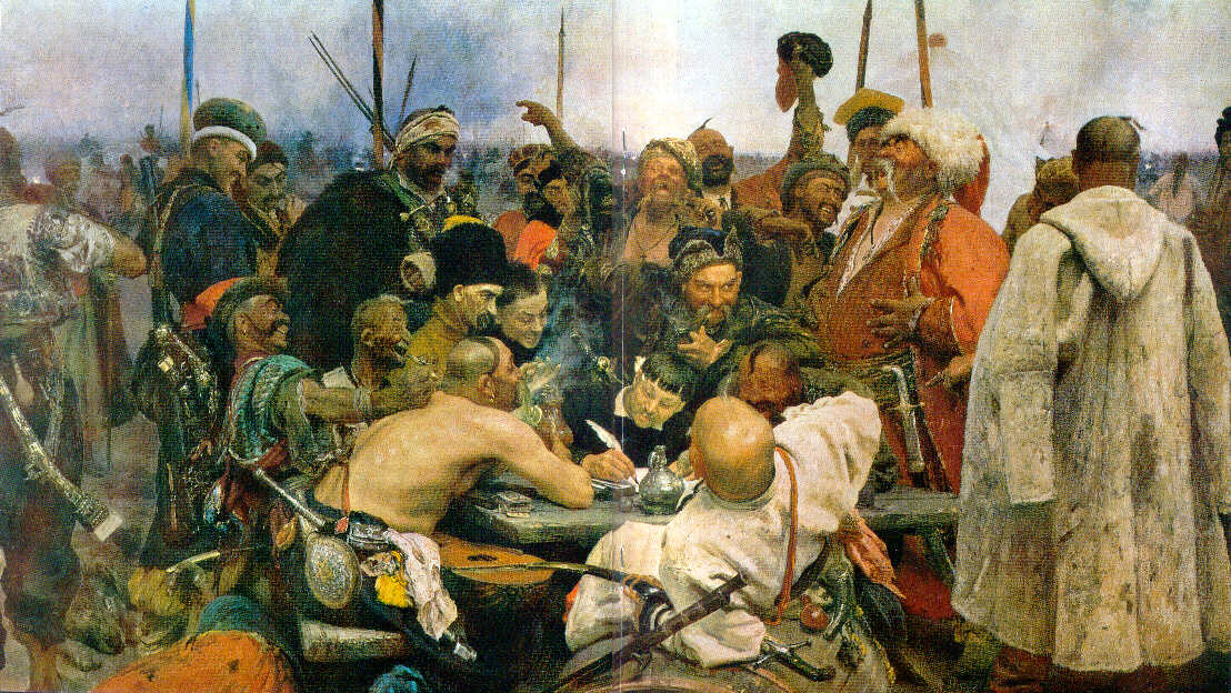
Zaporozhian Cossacks
of Ukraine Writing a Letter to the Turkish Sultan. Oil painting by Elias Repin,
1878-91. 6'8" x 11'9". The artist was born in Chuhyev, Kharkiv region on August 4, 1844. Elias earned money as boy by painting icons and portraits for local Ukrainian churches. The greatest oil painting by Elias Repin would be Zaporozhian Cossacks of Ukraine Writing a Letter to the Turkish Sultan . The painting captures the independent spirit of the Ukrainian Cossacks and people. This painting is located in the St. Petersburg Art Gallery in Russia.
1878-91. 6'8" x 11'9". The artist was born in Chuhyev, Kharkiv region on August 4, 1844. Elias earned money as boy by painting icons and portraits for local Ukrainian churches. The greatest oil painting by Elias Repin would be Zaporozhian Cossacks of Ukraine Writing a Letter to the Turkish Sultan . The painting captures the independent spirit of the Ukrainian Cossacks and people. This painting is located in the St. Petersburg Art Gallery in Russia.

Khai Tran
Khai Tran

I know we were supposed to add fine art from the textbook artists, but I am always inspired by a friend of mine. He's a young artist but to me is very talented. My brother in law owns one of the paintings of his that I really wanted. To me his paintings are very beautiful and his best paintings in my opinion are his more monochromatic and abstract.

Currently he's working on repainting several paintings at one time.
Steel Valley

This piece, "Steel Valley" (a lithograph), was created by Louis Lozowick, in 1936. This piece really caught my eye because of the use of color, specifically, the use of only black, white, and grays. I really like how you can see the use of texture, things like cross hatching and lines throughout the entire piece. In this piece, I also enjoyed the perspective the artist used, the main view was up high so you were able to see nearly everything in the scene.
Madame butterfly
Larry rivers
Madame butterfly
Larry Rivers was born on August 17, 1923. In was born in NYC. He also died in NYC. Rivers was an American artist, musician, filmmaker and occasional actor. Rivers resided and maintained studios in New York City, Southampton, New York and Zihuatanejo, Mexico. Ths painting is Lithograph and silkscreen and was done in 1978. I love how the American flag is in the background of his painting. The flag and the hat brings a lot of color to this painting. It is a very interesting painting.
Daniel Dove "Sentry"

This is an oil on canvas painting by Daniel Dove titled "Sentry"(2005). I found this painting very interesting because it appears to be the outlines of a deer or some sort of animal smelling or eating the flowers but the darkness of all the colors makes it stand out. The act of this animal is so natural, delicate, and simple but then add the dark coloring and it change the appearance. To me it looks like there is a storm coming in behind the animal but it doesn't seem to bother him because he's too busy smelling the dark and beautiful flowers.
Subscribe to:
Posts (Atom)